by Elsa van Helfteren
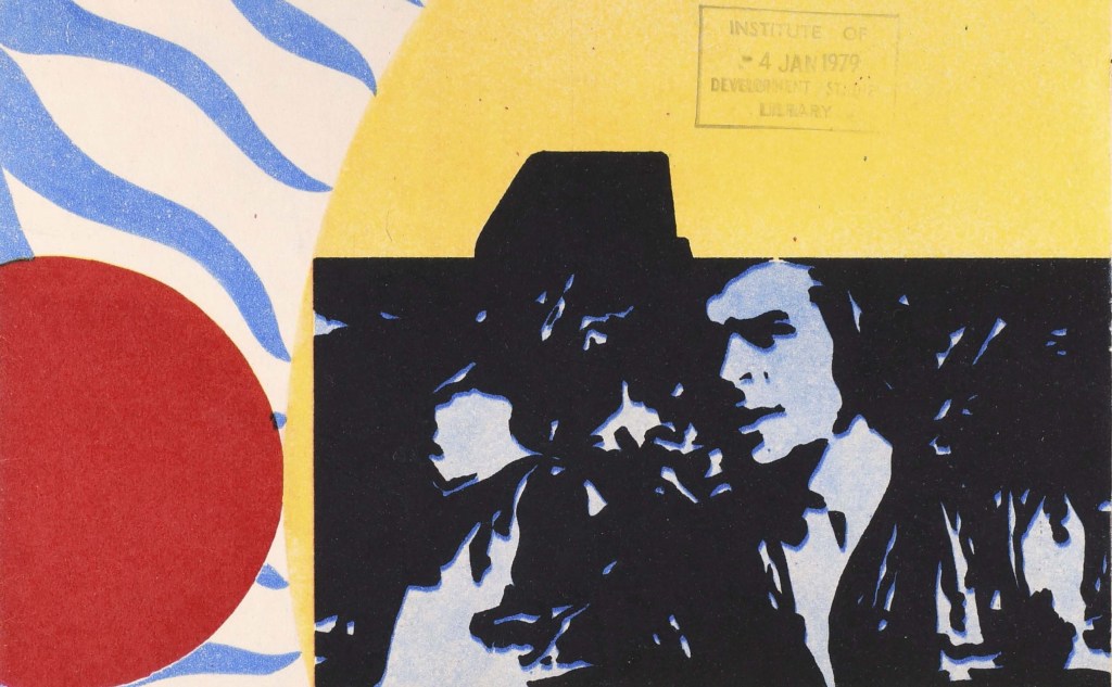
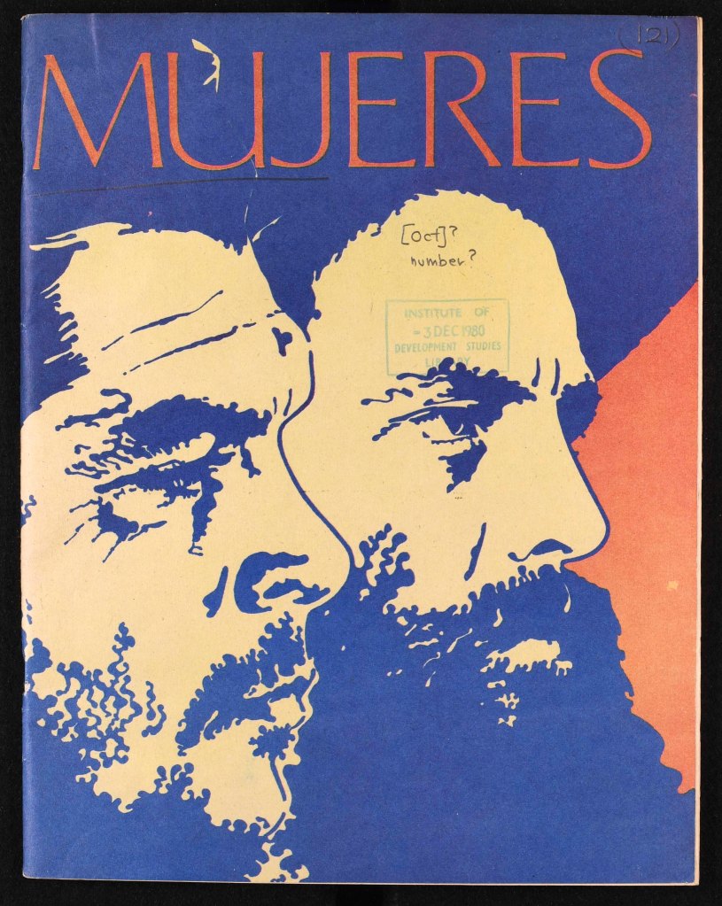
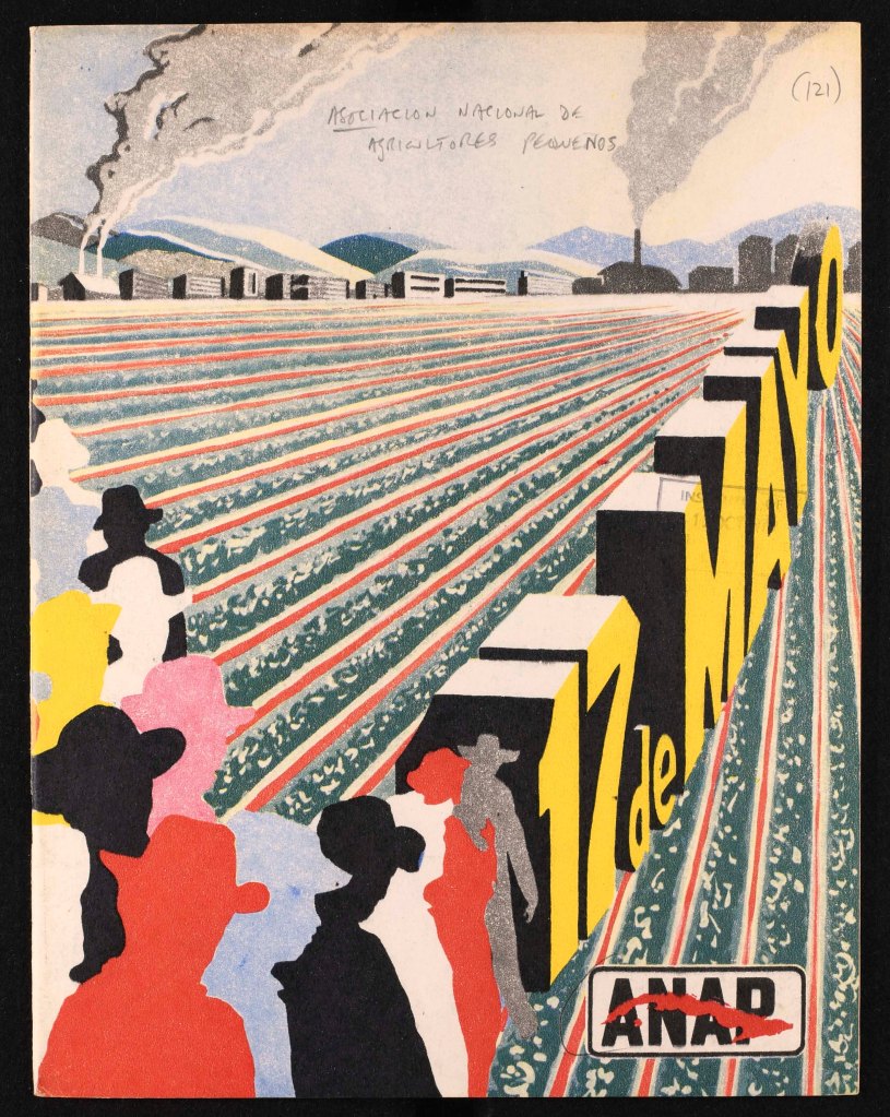
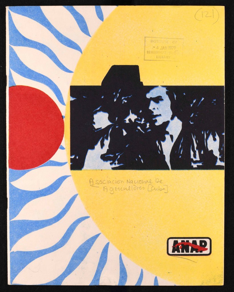
One of the strengths of the British Library for Development Studies Legacy Collection is how it illustrates the evolution of graphic design across the Global South. The aesthetics of the collection vary from country to country and across decades, but the Collections team here at Sussex have been particularly impressed by the iconic artwork and typography coming out of Cuba in the 1960s, 1970s and 1980s.
We recently pulled some documents out for some Art History students (who were interested primarily in the look of the material rather than the content) and thought we would share them with you in this first of a few blogs devoted to graphic design in the BLDS Collections.
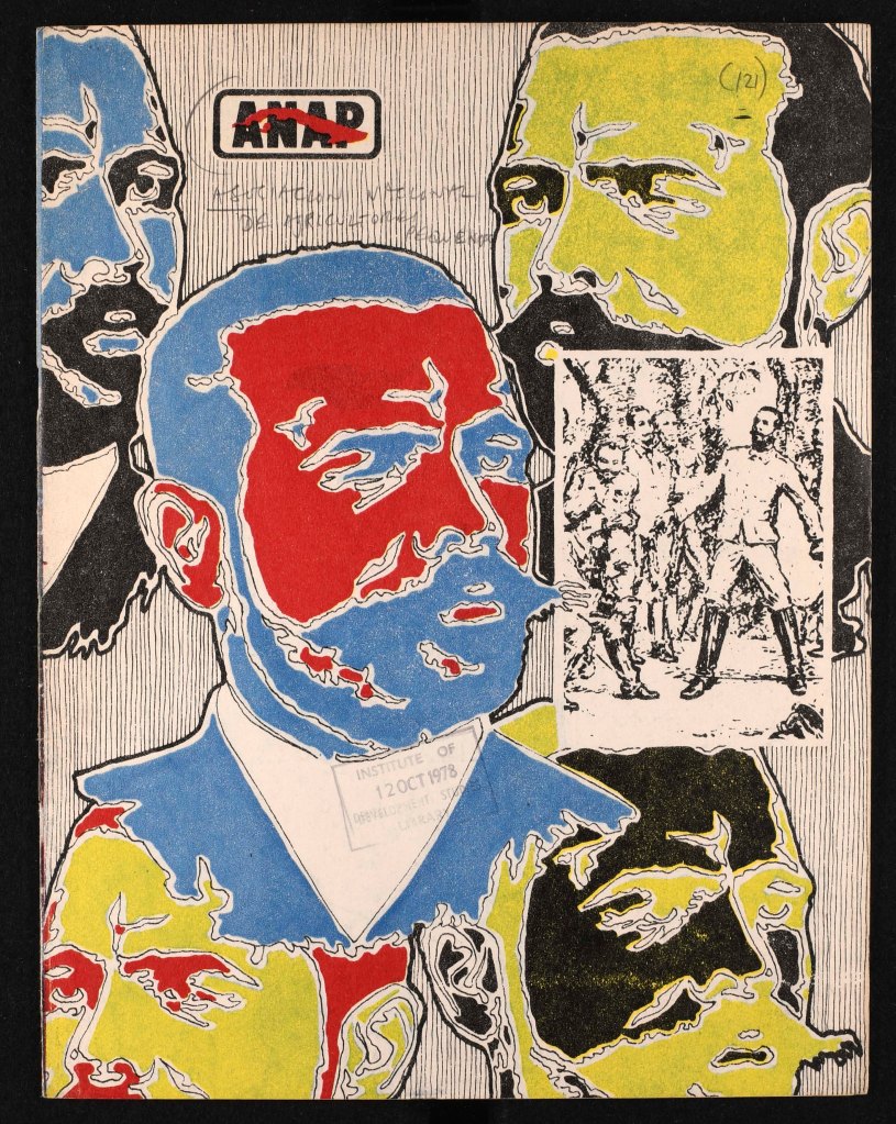
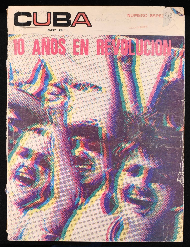
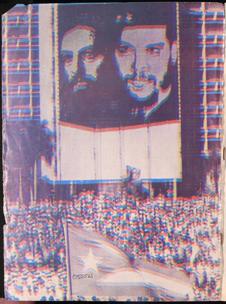
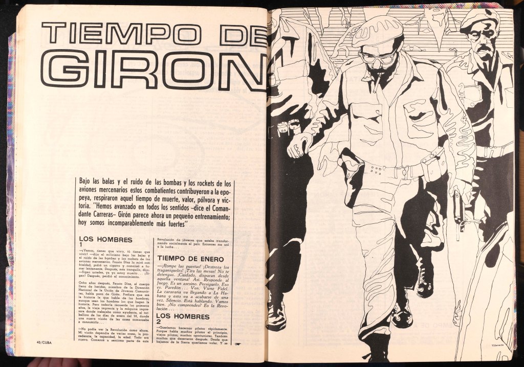
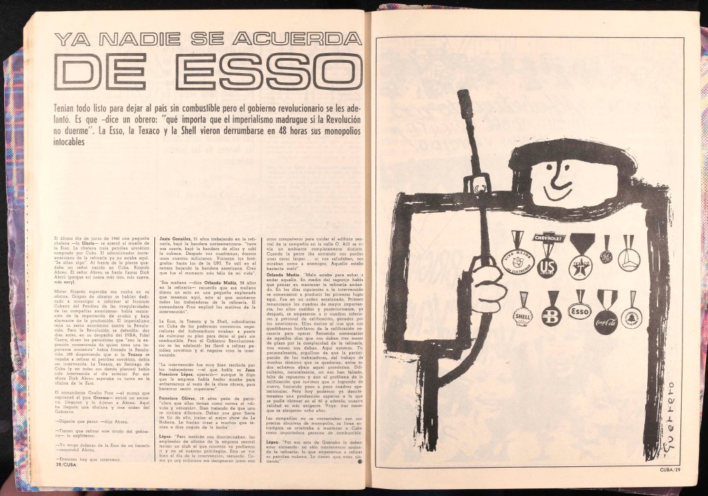
Following the 1959 Cuban Revolution graphic designers produced work with heavy typography and striking artwork to get the country’s radical message across with clarity and directness. This was reflected not only in overt political propaganda, but across publications like the magazine of The National Association of Small Farmers (ANAP) and Mujeres, a women’s magazine that reflected the work and leisure of Cuban women.

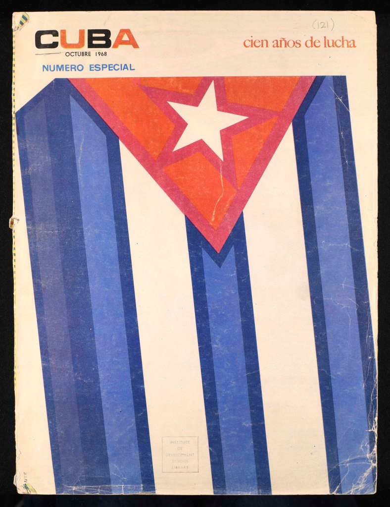
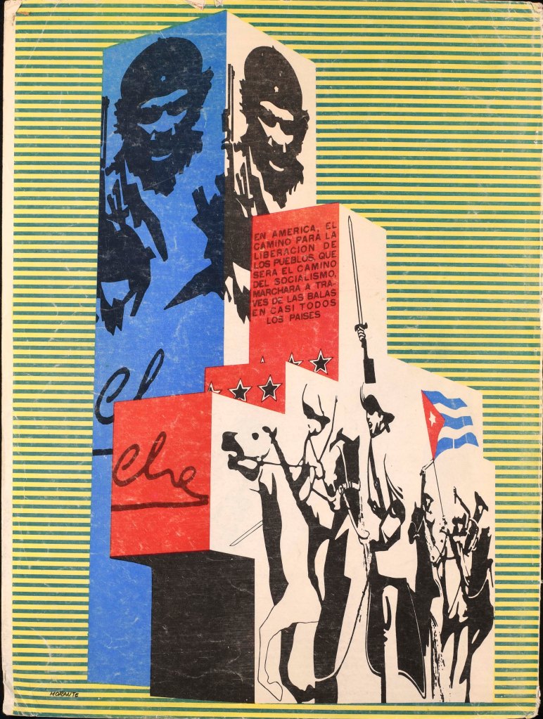
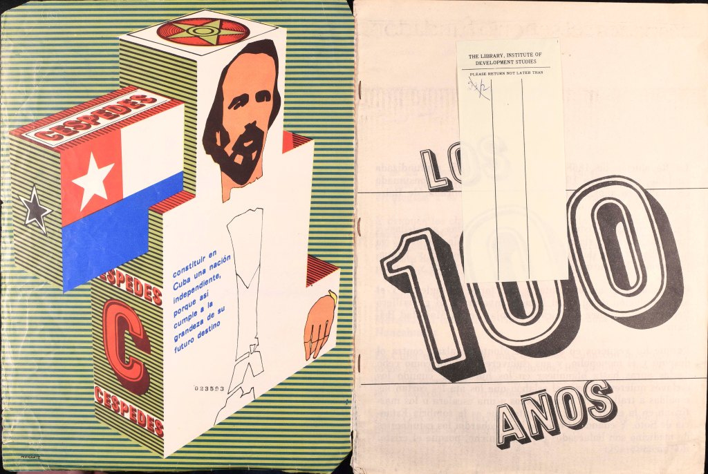
Other magazines included Cuba: Revista Mensual, published by Empresa Consolidada de Artes Graficas, which looked back on and celebrated Cuban revolutionary history with bold graphics and drawings to illustrate the radical articles within.
These publications are merely a taste of what we hold in the British Library of Development Studies (BLDS). These and many more are available to be viewed at the University of Sussex Library – to find out more please email library.collections@sussex.ac.uk.

One thought on “Aesthetics of the BLDS Collection: Cuban Graphic Design”